
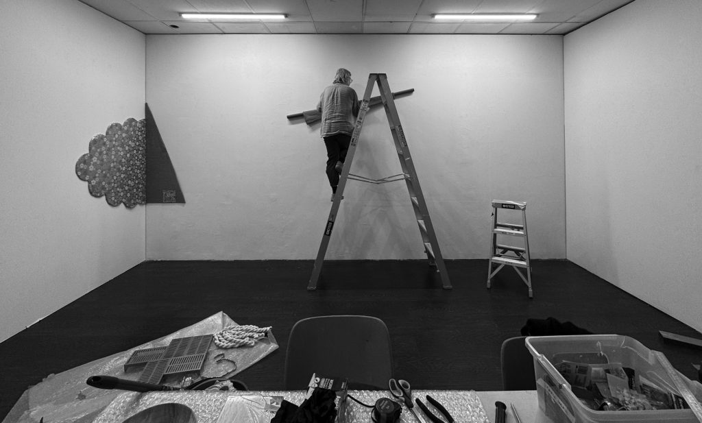
Louise Haselton installing work for silk/silver/spot at The Little Machine. See D for Denim, F for Flight, N for Noodling. Photo: Eleen Deprez
A is for Abecedarium, a children’s alphabet book. Here it functions as a primer for silk/silver/spot exhibition.
A is for Animism, the idea that inanimate objects, especially those of the natural world, have the kind of consciousness and agency that we attribute to human beings. In conversation with me in 2012, she observed:
“The idea of materials grouping and arranging themselves is a figure of speech. But I do feel directed by the materials and objects that I gather and spend time with; they all have their own life and energy that I draw from. Maybe it’s a way of giving over some of the responsibility of the art-making process. Ideas of animism are at play here.”1
Another animist quality is apparent in Event, which comprises two wooden plates, their centres perforated and silvered, stood atop a mirrored acrylic shelf. The plates have the appearance of eyes staring back at the viewer, and in this way are connected with earlier works including Scrutineers (2011), a group of rocks covered in mirrored discs which also seem to meet the viewer’s gaze. (See also ‘G is for Gaze, the’)
B is for Book. In TLM’s back gallery is Ikebana for All Seasons, a kind of wall-mounted book made from a framework of reclaimed wood (old garden stakes) and Masonite ‘pages’. Mounted on these are collages of colour-photocopies showing ikebana displays, over kozo paper. The photocopies are perforated with circular holes revealing the crinkled, coruscated surface of the silvery kozo paper beneath.
B is for Brain velour, a distinctive kind of ruched fabric. The folds of brain velour are made by threads running through the fabric, and pulled so that it wrinkles, creating its distinctive texture. Like cerebral matter, the brain velour here is a grey-beige in colour. Haselton’s uses it in the sculptural assemblage It’s Windy Outside.
C is for Corners. Haselton has long had an interest in corners. She painted some of her two-word Palindromes on the external corners of buildings – a word on each wall. This exhibition includes a new corner work, New World, which occupies an internal corner of TLM’s main gallery.
D is for Denim. Umberto Eco devotes an essay to the semiotics of denim jeans.2 Haselton has used denim jeans on a number of occasions in her work, and the legs of a pair appear in Wall Gathering 1. I initially thought they were flared, but in fact they taper towards the ankle, suggesting a quite different semiotics.
D is for Dolly Parton, who famously said: “It costs a lot of money to look this cheap”. Haselton refers to this quote more than once as she installs her exhibition.
E is for Earth Tones. Post-pandemic, earth tones are in. But that’s not the reason why brown, beige, grey-pink and olive green have a presence in this exhibition. (Even the cast aluminium grills in Wall Gathering 2 are painted a pale puce.) Haselton has long had an interest in conceptions and categories of the natural, and in natural materials including unprocessed wood and fibres. The Sōgetsu school of ikebana gives a place to earth in its tripartite division of the universe, and that plays a role in this exhibition. (See ‘I is for Ikebana’.) Earth colours also have bodily associations that have longstanding place in Haselton’s work (See ‘F is for Fingers’ and ‘P is for Post-Minimalism’).
E is for Eyes, see ‘G is for Gaze, the’.
F is for Fingers. Haselton has ten of them. She has also made a series of sculptures featuring arrangements of life-size bronze fingers. Haselton allowed us to show one of these, Fingertree (2000), at TLM as part of Zinegeist, our zine and art book fair, as a taster for this exhibition.
F is for Flight. Sitting on the bench in TLM’s main gallery space (the bench is composed, art fair style, of two packing crates for Louise’s artworks), looking across to the north and east walls, it seems to me that two works, Wall Gathering 1 and Wall Gathering 3, are taking flight – with Wall Gathering 2 not far behind. They are, of course, inanimate, still assemblages, but they seem to leap, stretch and arc, and levitate. 1 and 2 have little, cloud-like aluminium butterfly wings (powder-coated to look chrome). In addition to its wings, 1 comprises a long, velvet-covered tube angled upwards and clad in two tapered (or flared) legs of denim). Yeehaa, I want to shout as it ascends to the Empyrean.
F is for Formalism. Formalism holds that the distinctive value of visual art is non-representational and supervenes directly on ‘formal’ qualities such as shape and colour – the qualities that artworks present to directly to vision. Haselton is no formalist.
G is for Gaze, the. The two wooden plates in Event seem to look at the back at us, like eyes. At the centre of each is a hole, surrounded by shiny-bright silver leaf. In the Four Fundamental Concepts of Psychoanalysis, Jacques Lacan narrates a story from his youth about the phenomenon of animate objects that seem to stare back at us.
“One day, I was on a small boat, with a few people, […] while we were waiting for the time to pull out the nets, the one named Petit-Jean […] showed me something floating on the surface of the waves. It was a small can, […] a sardine can. […] It glimmered in the sun. And Petit-Jean said to me – You see, this can? Do you see her? Well, she doesn’t see you! This little episode, he thought it was very funny, me, less so. I tried to find out why I found it less funny. It’s very instructive. First of all, if it makes sense for Petit-Jean to tell me that the can doesn’t see me, it’s because, in a certain sense, she’s looking at me […] and that is not a metaphor.”3
H is for Hahndorf. Haselton bought pieces of huon pine in Hahndorf.
H is for Huon Pine, which grows naturally only in Lutruwita / Tasmania. The two half-round stands for the wooden plates in Event, in TLM’s window, are crafted from huon pine.
I is for Ikebana. Perhaps you have noticed that each of the works in the TLM main gallery is comprised of three elements. That is a constraint Haselton has adapted from ikebana – in particular, from the ikebana practices of the Sōgetsu school. Ikebana is the Japanese art of flower arrangement. Applied with some pragmatic modification, it has all the ingredients for a technique of sculptural composition. The Sōgetsu school, founded in 1927, allows the combination of all kinds of materials in its arrangements – not merely flowers and plants, but every kind of natural or human-made material. In this, it varies from older forms of Ikebana, and converges with practices of modern and contemporary sculpture which partly inspire it. Sōgetsu requires that three distinct elements, of differing heights or lengths, are arranged together. The tallest, or longest, symbolises heaven; the shortest symbolises the earth; and that of medium height or length symbolises the human. Within this simple formal and symbolic scheme, all kinds of formal play and rumination on the place the human in the broader world can play out. Another modern aspect of the Sōgetsu school is that it understands ikebana as expressive of the practitioner’s inner being – like modern and contemporary art, it is a self-expressive practice. Interestingly, the elements that mark Sōgetsu out as a distinctively modern art are also responsible for the jarringly pop or kitsch character of some of its products. Consider the images reproduced in Stella Coe’s book, Ikebana: Practical and Philosophical Guide to Japanese Flower Arrangement, which played a key role in promoting Sōgetsu outside Japan.4 In one, a lone pink rose, not yet in full bloom, is imprisoned within a tangle of spiky Hawthorn. The sad, set-upon rose looks like a cliché, and the choice of plants incongruously suggests the bucolic England countryside rather than Japan. In other pieces the use of driftwood or industrially-manufactured lengths of extruded plastic integrated into arrangements can look kitschy, and the blank, brilliantly-coloured fields against which they are photographed seem to draw on the look of commercial photography of the 1980s. But there are different ways of seeing these things. They might be seen as errors of taste, a failure to live up to some ‘authentic’ Japanese model. But they can also be seen as an authentic expression of the Sōgetsu school’s avant-garde principles.
This, I think, is the way that Haselton interprets and adapts Sōgetsu approaches. These principles, rather like the principles of modern sculpture, permit modern materials – in these works of Haselton’s synthetic fabrics, reflective plexiglass, rubber and sequins are present alongside traditional materials such as felt, velvet and silk. Haselton’s works also accommodate markers of place, environment and culture – especially vernacular and ‘feminine’ culture, seen in floral patterning, ruched fabric, and lustrous ropes and sheafs of silk. And they welcome expressions of self and sentiment. These objects and materials press close to one another. Some of the works seem to rise, buoyant; others are settled. Some feel still, others seem as if in motion.
J is for Japonisme, see ‘I is for Ikebana’.
K is for Ken Bolton, poet and colleague of Haselton’s at the Experimental Art Foundation (EAF), where she worked from 1994 to 1996. Bolton’s poem about Haselton, In Frank Anticipation 11.9.14, written for her exhibition Outsides (EAF, 2014), is reproduced in Louise Haselton: Act Natural.
L is for LooseFit, a black and white screenprint on aluminium panel featuring the text, ‘loose fit’. It is part of Haselton’s Oxymoron series, from 2001.
M is for MagicObject, the 2016 Adelaide Biennial of Contemporary Art, curated by Lisa Slade. Haselton was among the exhibitors. The Biennial was developed around the idea of the artist as conjuror, a theme especially apt for Haselton. Many of the pieces in this show, ten years later, also seem magically imbued with unruly life or introverted stillness by their creator.
N is for Nature. Nature, at least as we usually think of it, is mostly an invention of eighteenth-century European Romanticism.5
N is for Noodling. Haselton likes to noodle, as she puts it, tweaking, adjusting, pulling, balancing the elements of her works until it feels right, looks as it should, as it wants to be. What, we may ask, does this ‘feel’ or ‘look’ of rightness mean? It is something that Haselton recognises, when she sees it, and no doubt, we should be able to perceive it too, although perhaps we will need to sharpen and refine our visual abilities as Haselton has. I wonder if Haselton is sometimes looking for an impression of stillness that is not merely stillness, but the product of forces in balance. Elements in each work seem to be attracted, pressed together, or to retain a sombre distance, each somehow mindful of the other, or to have unfurled into some state of resplendent levitation. But this apparently natural balance of forces is illusion; it is merely ‘acting natural’ – an invention, the product not of nature, but noodling.
O is for Oxymoron. ‘Act natural’ is an oxymoron. It appears in a work in Haselton’s Oxymoron Series (2001), and gives Haselton’s Wakefield Press monograph its title.6
P is for Palindrome. Haselton has a longstanding fascination with wordplay; oxymorons are one aspect of this and palindromes another. A range of her earlier works, utilising text, make use of these linguistic forms.
P is for Polychrome. Sculpture in the West, from the Renaissance, and including much modern and contemporary sculpture, tends towards the monochrome. Think of white marble nudes, for instance. Monochrome sculpture is a historical aberration. In many traditions sculpture is richly decorated with colour and shining surfaces. Since her movement away from text-based work, Haselton’s sculpture has also rejected monochromy, in favour of a sometimes riotous polychromy. This change has corresponded to her developing interest in the visual cultures of India and Japan.
P is for Post-Minimalism. Within the tradition of Western sculpture, Haselton’s work is allied most clearly with Post-Minimalism, a loose grouping of artists, many women, who from the 1960s rejected the industrial media and techniques of Minimalists – who were overwhelmingly men. Instead, the Post-Minimalists embraced a plurality of media and technique, some of which had associations with the ‘feminine’ activities associated with domesticity and craft. They also found an alternative to the Minimalists’ inviolate geometric forms in the biologically oriented forms recalling pulsing and sagging innards, the organs, membranes and tubes. It’s Windy Outside has a close affinity to this aesthetic in its digestive-tract–like arrangement of heat-formed acrylic and rubber cord arranged on felt, and the brain velour which frames it.
Q is for Questions. In 2012 I interviewed Haselton for a publication that documented her 2011 exhibition, Errand Workshop, at the Contemporary Art Centre of South Australia. I asked her questions, and she kindly answered. I’ve transcribed an excerpt from one of her responses above (‘A is for Animism’). All her responses are generous and enlightening. The publication can be accessed online.7 Introducing the interview, I recorded some of my early perceptions of Haselton’s practice in the late 1990s and early 2000s:
“Haselton did not start quite so often with the ready-to-hand objects and forms that others did, and her particular patterns of thought shaped them in very distinctive ways. […] Haselton also seems to cast around for things that are marginal to, or outside what we could call that ‘natural’, pre-existing space of shared experience, requiring us to extend the space of our own experience […] I feel too that her objects have a prickly quality, chiding me when I fail to live up to this high standard.”8
R is for Ruching, see ‘B is for Brain Velour’.
S is for Seasons,see ‘W is for Winter’.
T is for Text. Why did Haselton move from conceptually oriented text-works to her more visually and materially oriented practice? In fact, both kinds of practice reflect a deeper continuity. Throughout her practice Haselton has made use of constraints and other conceptual armatures. Those that governed her use of text, are one kind of constraint – the Oulipo-esque forms of oxymorons and palindromes. Those she has adapted from Ikebana and applied to the works in TLM’s main gallery, are another.
T is for Time. Curator Gillian Brown observes, “It is part of Haselton’s nature to sit with her materials until she finds the correct context for them”, an impetus that might feel as if it comes from the material itself. (See ‘A is for Animism’.) Collected and found materials and objects surround Haselton in her studio, and they sometimes take years to find the right place in her work. I see that as encouragement for the viewer to also slow their attention, clear the mind of distraction, and allow Haselton’s objects to work on them.
U is for Uncanny, the sense of creeping dread aroused by tales of the supernatural. The undead are uncanny (when they do not provoke outright fear or terror), in part because the idea of something that is dead yet acts as if alive throws into jeopardy our rationalist and scientific worldviews. In a similar way, feeling surveilled by an animate object – as we might do by Event, with its silvered ‘eyes’ that looking back at us – can also elicit an uncanny shiver.
V is for Velvet, It’s Quiet Inside includes a vertically positioned strip of frayed antique velvet. The dark blue velvet sits, somehow seeming very still and cool, atop a rectangle of beige felt, and alongside a vertical tube covered in glistening silver-sequined fabric.
W is for Winter. Haselton earlier conceived some works as having the titles Winter, Spring, Summer, and Autumn. There is a tradition in ikebana of making arrangements corresponding to the seasons. It’s Windy Outside could be ‘Autumn’, and It’s Quiet Inside, with its glistening icy sequins, could perhaps be ‘Winter’.
W is for Wonder. Brown describes the wonder that Haselton’s work evokes for her. Likening them to the prehistoric monuments that dot her native Scotland, she finds Haselton’s art conjures, “a fascination with how things came to be, an awareness of being in the presence of something just beyond comprehension […] . These are objects […] that transcend the practicalities of their construction without obscuring the process that brought them into being.”9
X is for X-shaped. Small Fingers (2007) is another of Haselton’s bronze finger sculptures. It is a cast of two little fingers clasping one another, in an X-shape. They are making a pinkie promise. Small Fingers has not been shown at TLM – and nor have Haselton’s palindrome works or Oxymoron Series (which is in the Art Gallery of South Australia collection).
Y is for Years Without Magic. This 2007 exhibition at the South Australian School of Art gallery featured the work of Haselton alongside that of Bridget Currie. Lisa Kelly and Peter MacKay contributed writing to the catalogue. It seems to me that Haselton’s and Currie’s practices converge in certain ways around this time, and come to define something of a post-conceptual Adelaide style in sculpture, in which nature – fraught concept as it is – is a key concern.
Z is for Peter Zumthor, the Swiss architect. Haselton especially likes his Bruder Klaus Field Chapel.
– Michael Newall, November 2026
- Errand Workshop, exhibition catalogue, Adelaide: Contemporary Art Centre of South Australia, 2012: 20. https://issuu.com/cacsabroadsheet/docs/haseltonfull
↩︎ - Umberto Eco, ‘Lumbar Thought’, trans. William Weaver, in Umberto Eco, Travels in Hyperreality: Essays, San Diego: Harcourt Brace Jovanovich, 1986.
↩︎ - Jacques Lacan, The Seminar of Jacques Lacan, Book XI: The Four Fundamental Concepts of Psychoanalysis, ed. J.-A. Miller, trans. A. Sheridan, New York: Norton, 1981: 95. This translation retains the gendered possessive pronoun, ‘hers’, from the original French.
↩︎ - Stella Coe, Ikebana: Practical and Philosophical Guide to Japanese Flower Arrangement, Century Publishing, London: 1984.
↩︎ - See, e.g., Marjorie Hope Nicolson, Mountain Gloom and Mountain Glory: The Development of the Aesthetics of the Infinite, New York: W. W. Norton & Co., 1959 and Terry Eagleton, The Ideology of the Aesthetic, Oxford: Blackwell, 1990.
↩︎ - Gillian Brown, Leigh Robb, Jenna McKenzie, Louise Haselton: Act Natural, Adelaide: Wakefield Press, 2019.
↩︎ - Errand Workshop, exhibition catalogue, Adelaide: Contemporary Art Centre of South Australia, 2012. https://issuu.com/cacsabroadsheet/docs/haseltonfull
↩︎ - Ibid.: 14.
↩︎ - Gillian Brown, ‘Pre-Encounter-Post: Thoughts After an Experience’, in Gillian Brown, Leigh Robb and Jenna McKenzie, Louise Haselton: Act Natural, Adelaide: Wakefield Press, 2019: 11.
↩︎